From Color Wheels to Moods: A Comprehensive Guide to Choosing the Perfect Colors for Your Home
Daniel WroblewskiAs the owner of Visual Wave Prints, I understand the importance of color in design. We offer customized colors for our designs because I know how color has the power to evoke emotions, set moods, and create atmosphere in a space. However, choosing the right colors can be daunting with so many available options. This is where color theory comes in as a helpful guide.
The color wheel is a visual representation of all colors and their relationships to each other. It is divided into warm colors, such as red, orange, and yellow, representing energy and excitement, and cool colors, such as green, blue, and purple, which evoke calmness and relaxation.
Color theory also introduces the concept of color harmonies, which are combinations of colors pleasing to the eye. Complementary colors, for example, are opposite each other on the color wheel and create high contrast when used together. Split complementary colors combine one color and the two hues adjacent to its complement, while analogous colors are next to each other on the color wheel. Monochromatic colors are shades of one hue and create a cohesive, calming effect.
When choosing colors, it's important also to consider color temperature, which refers to the warmth or coolness of a color and affects the mood of a space. In addition, the natural light in a room and existing furnishings and finishes can impact a color's appearance, so it's essential to take these elements into account.
Gather inspiration from fabric swatches, art, and nature to create a color scheme. Choose colors that you love and make you feel good. If you're starting with a neutral base, such as beige walls and neutral furniture, you can add pops of color through accessories, art, and textiles, making it easy to change the color scheme over time.
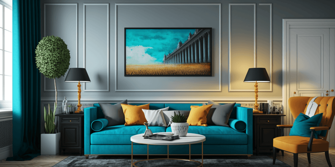
 If you need help, start with a neutral base and incorporate bold hues through accents. Timeless neutrals like white, beige, gray, and black make an excellent foundation for any color scheme. Alternatively, choose a statement piece, such as an area rug or piece of art, and build your color scheme around it. To prevent a space from becoming overwhelming, balance bold colors with neutral tones. Texture also plays a role in color selection, so consider how different textures can alter the perception of color.
Finally, the psychological effects of color must be considered. Different hues can evoke different emotions and affect moods. When choosing colors, think about the mood you want to create in the space and choose hues that will support that mood.